
Monzo · 2023–2024

From pay later to an everyday credit card.

I led design as Flex became a credit card: one view of the whole balance, repayments people could actually understand, card defaults and more.

  • Design across 2 squads · Growth & Core
Project outcomes

A credit card that won awards.

+37%Retention
−15%Customers missing payments
−20.5%Payment-related complaints
+26%Users increasing limits

+25% Engagement+10% Average Flex spending+8% NPS−7% Customer support contacts

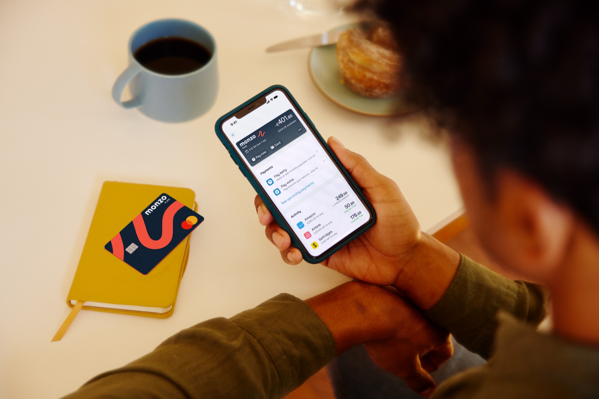
A customer using the Monzo Flex account on a phone, with a Monzo card nearby
Product of the day · 11:PulseTwo awards · Best Credit Card Provider in the UK ↗
The product

Flex was more than buy now, pay later.

Monzo is a UK digital bank with over 10 million customers. In 2021 it launched Flex, a hybrid of buy now, pay later and a credit card: one credit limit, with an instalment plan for each purchase.

  • Not tied to a retailerKlarna-style plans depend on the shop. Flex worked wherever you could pay by card.
  • Move it afterwardsCustomers could move a purchase from their current account to Flex after paying.
  • A finish line for every purchaseEach plan had a clear end date, so people could see their debt going down.

By early 2023 Flex was 15% behind its customer goal. It needed a new position, and an experience that could live up to it.

I joined full time in February 2023 to land that vision in five months. I covered both squads, Growth and Core, working with a researcher, marketing, legal and compliance.

01 / Reframe the promise

The product said “pay later”. Customers already used credit cards.

First we needed to know why people weren’t applying. We surveyed 1,924 eligible customers who had never tried Flex.

used credit cards65%

used BNPL9%

71% already knew Flex. It just didn’t sound like it was for them.

Most saw it as BNPL or weren’t sure what it was, so more visibility wouldn’t fix it. Flex had to matter to people who already had a credit card.

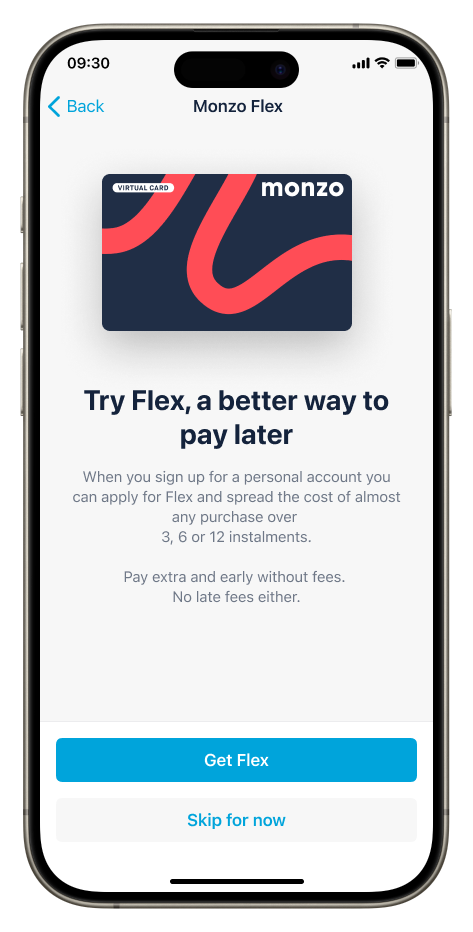
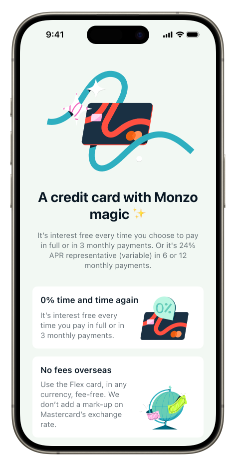
Before: Try Flex, a better way to pay laterAfter: A credit card with Monzo magic
BeforeAfter

Our hypothesis: positioning Flex as a credit card would bring in more customers. It did.

+7.1%In the appNew copy and an intro screen at Flex entry points. Accounts created against control.
+20%In a campaignCredit card messaging tested with 870k customers. Accounts created against our best previous message.

New words weren’t enough. A credit card has to behave like one.

I audited the product and interviewed 20 customers with our researcher. Flex was built around single purchases, and people wanted to manage the account as a whole. They couldn’t even pay off their balance in one go.

02 / Bring the account together37%

of Flex customers had more than 10 active purchases. To change what they paid each month, they had to open every purchase, one by one.

02 / Bring the account together

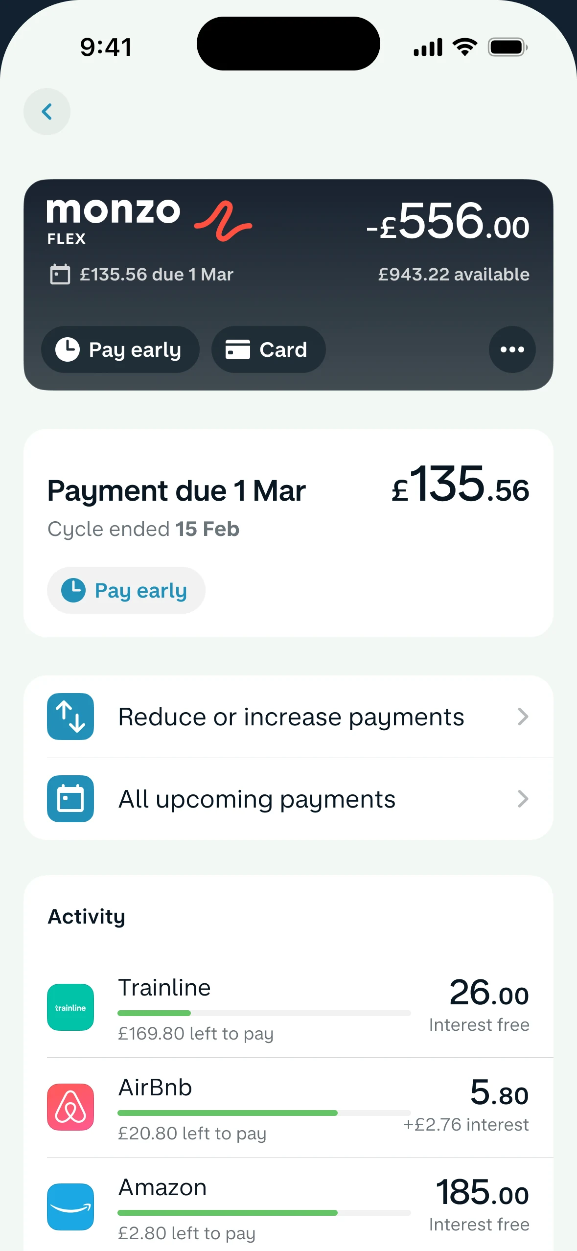
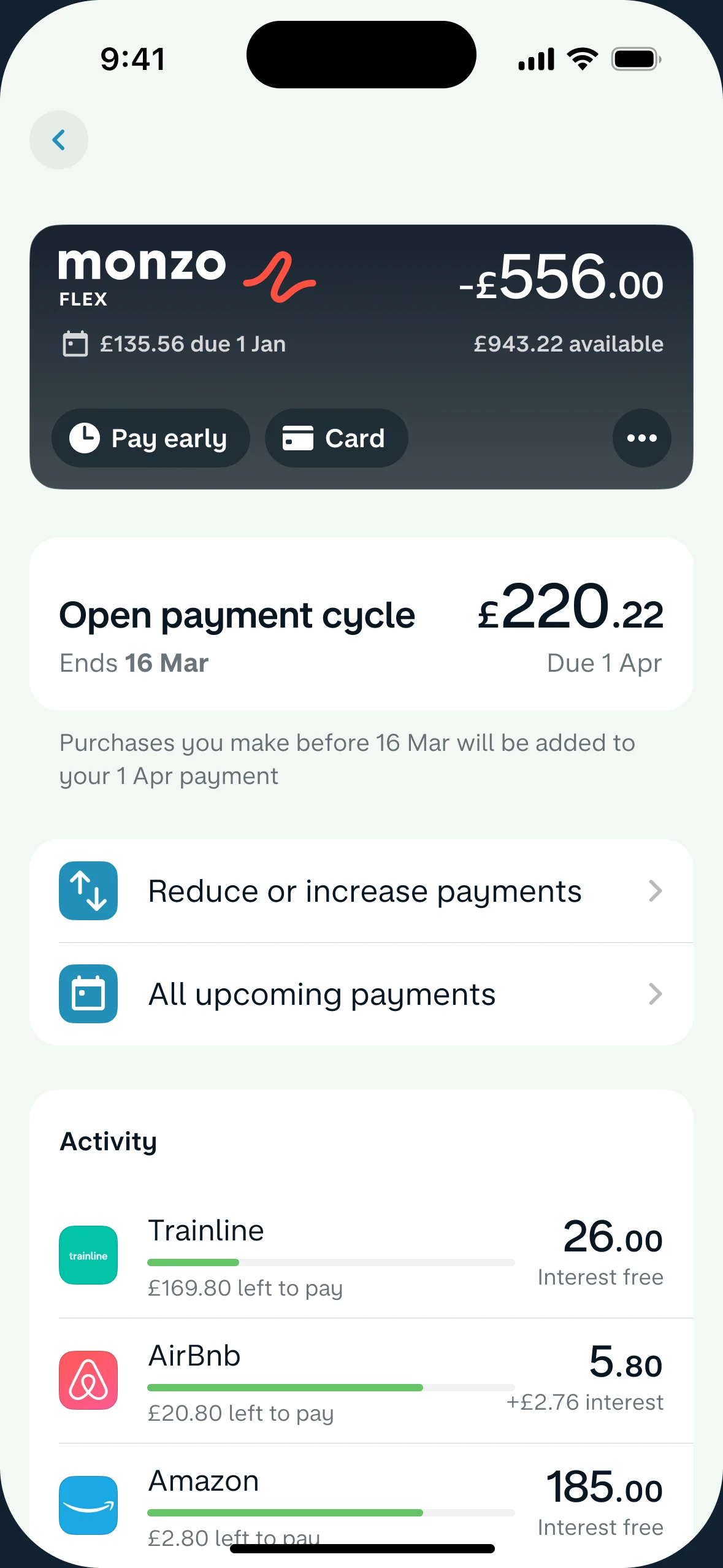
One balance. A clearer starting point.

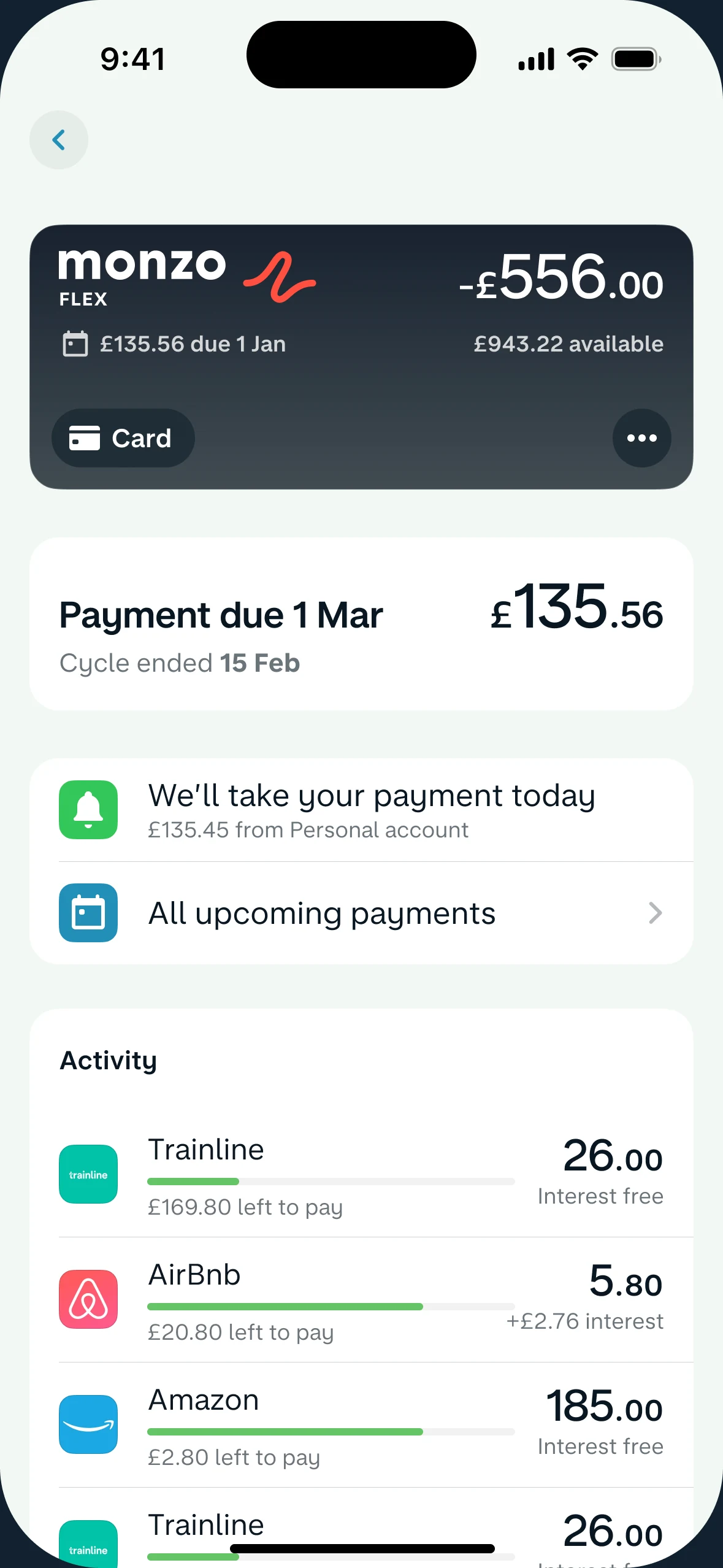
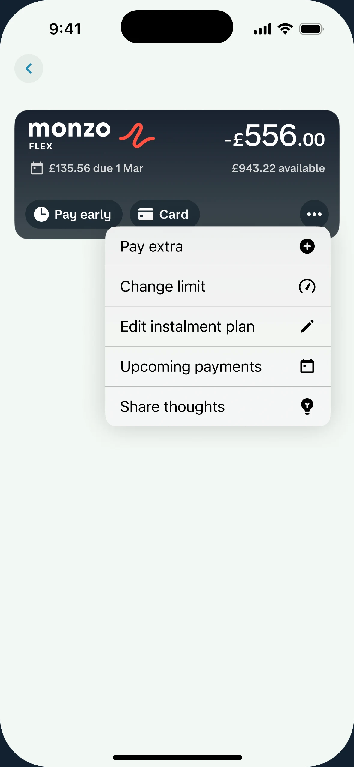
I brought the card, balance, limit, next payments and activity into one view.

9/10participants completed tasks unaided in the second usability round.
Research, mapped onto the screen

Every section had to earn its place.

Interviews and data became a map of what customers came to do. Then I ranked each one on the layout itself.

The Flex account screen used for the research map, from balance and payment actions down to activity, controls and documents

Hover or tap a note to see where it landed.

One job was still unmet: changing what you pay each month ↓
03 / Make repayments understandable

Show what each choice changes.

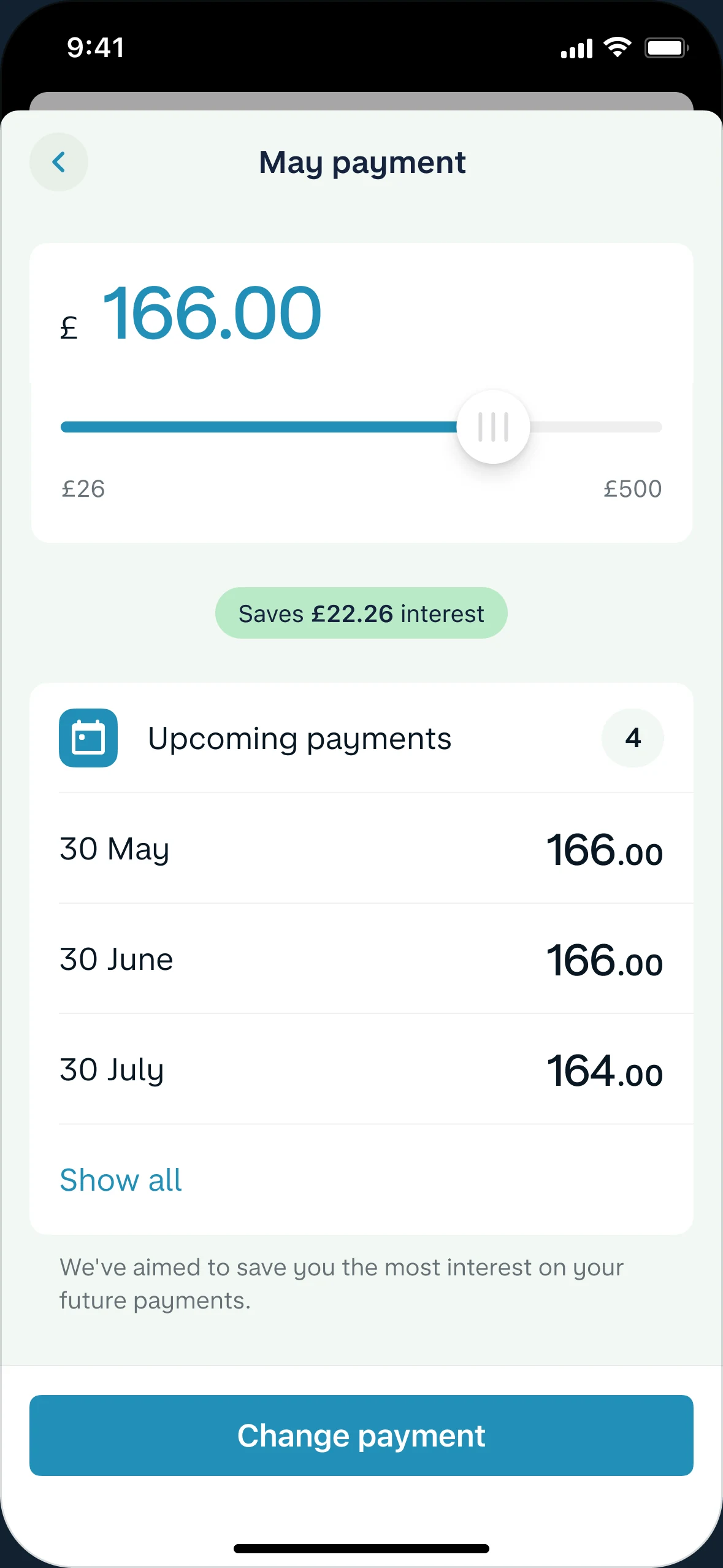
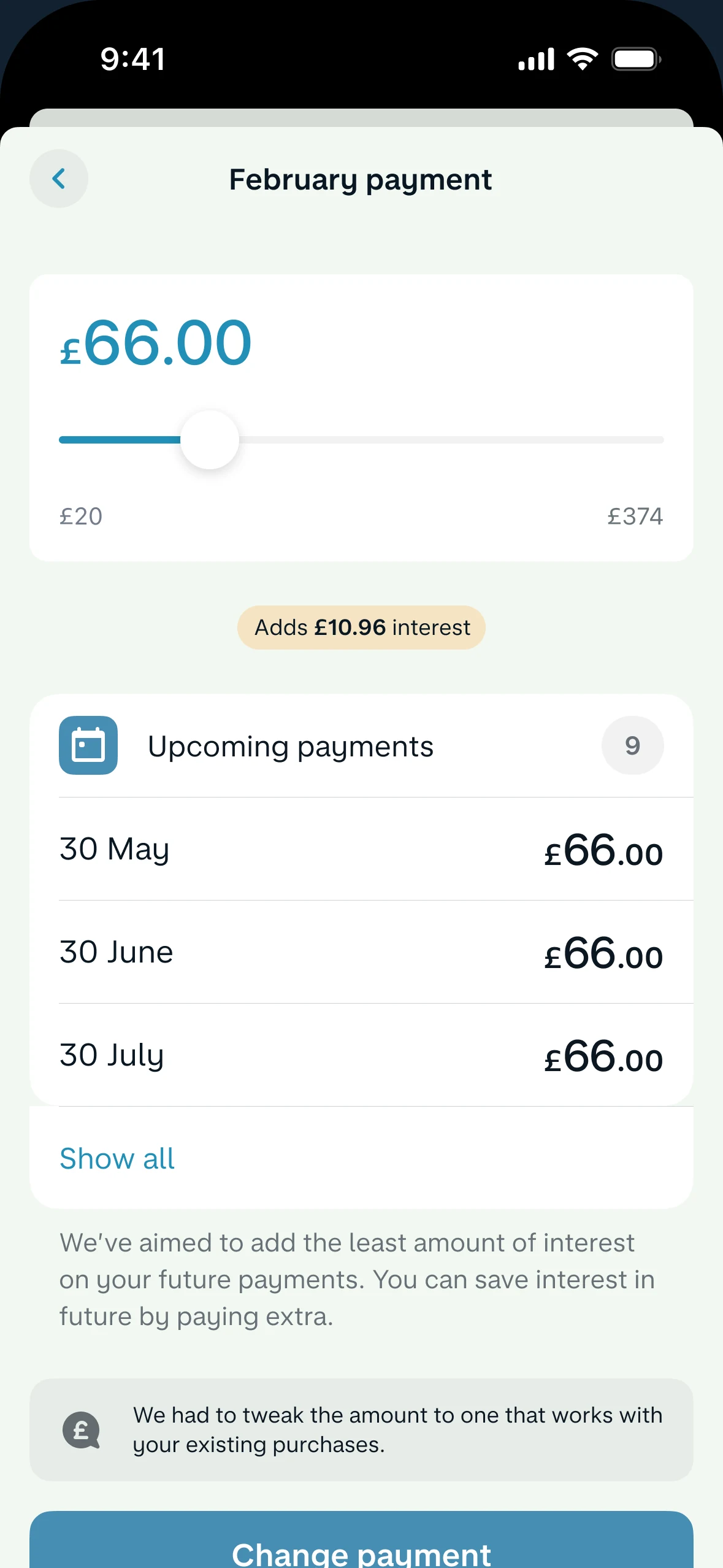
Customers wanted to say how much they could pay, without editing twelve purchases. So one amount became the starting point. Move the slider.

  • Each amount shows its effect on interest before anyone confirms.
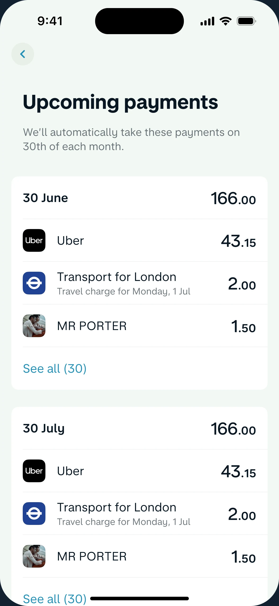
  • The months ahead update with it, so the choice feels concrete.

May payment

£90.00
£26£500
No changes to interest
Upcoming payments6

A working sketch of the idea, with illustrative numbers.

In credit, less friction isn’t always better.

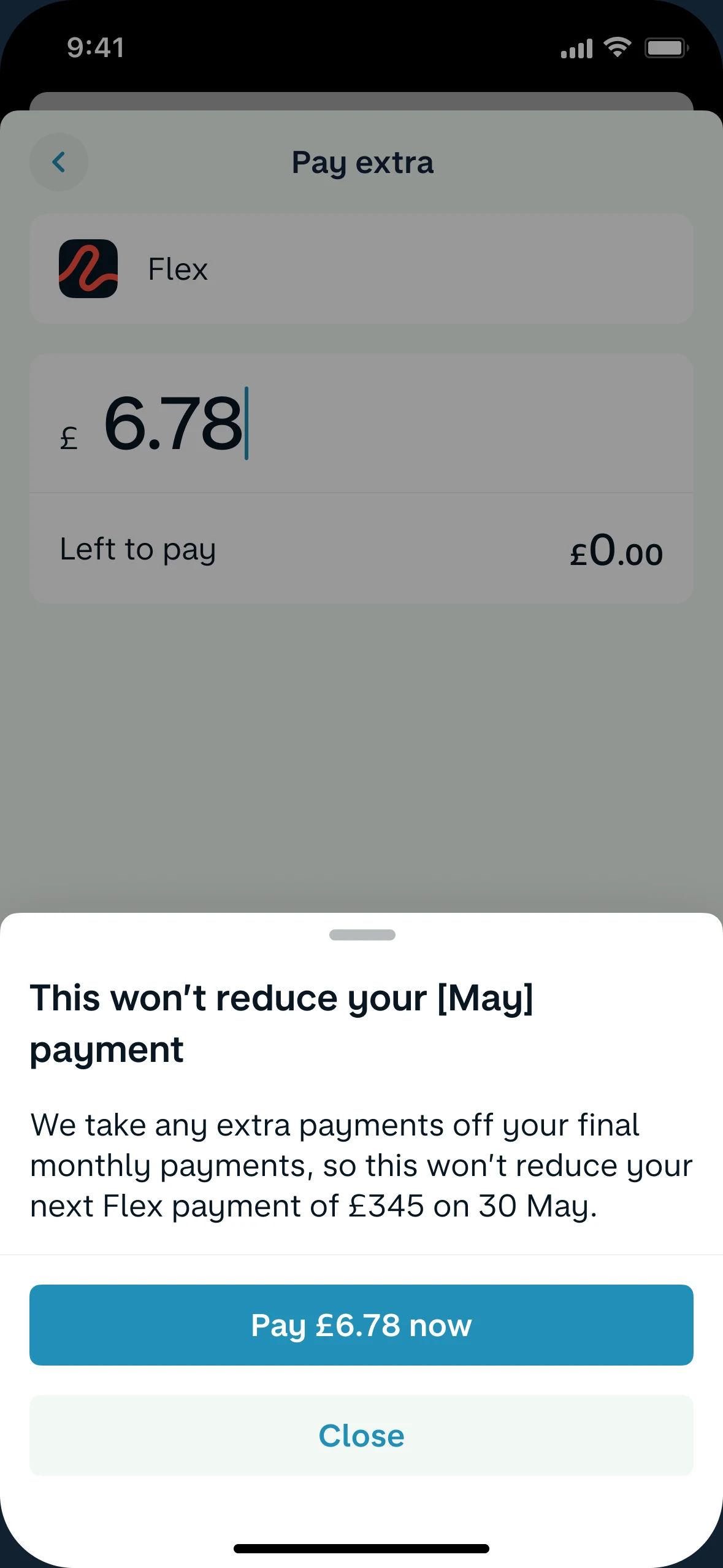
Some steps should disappear. Others should slow you down for a moment. Tap through both.

Pay extra

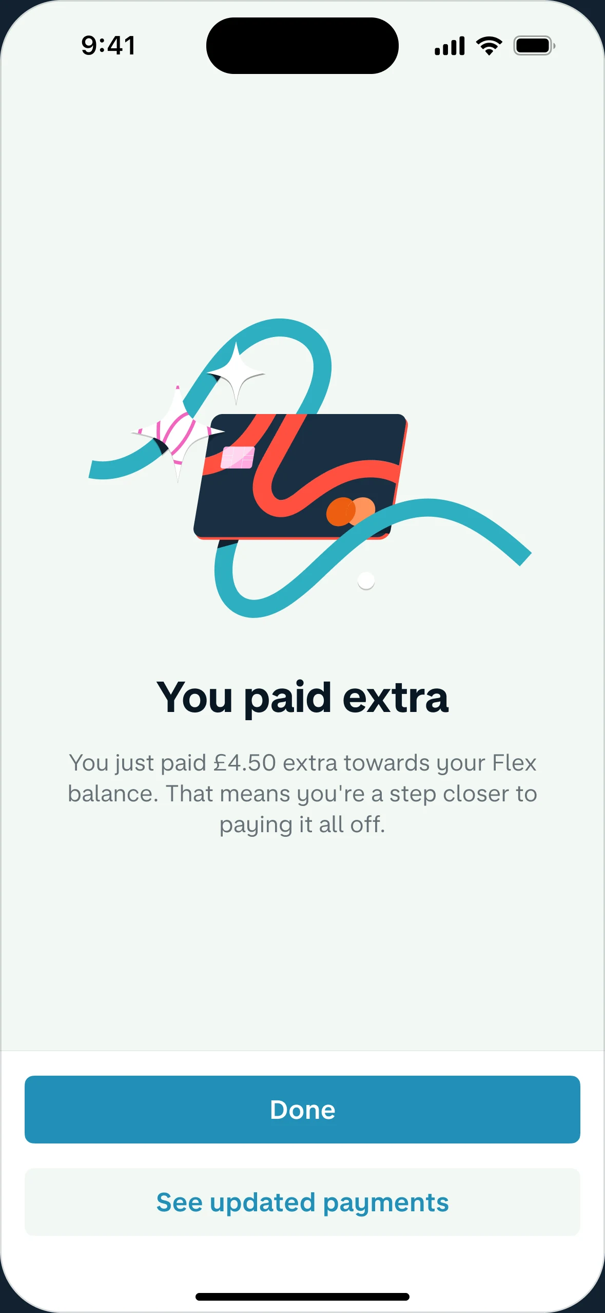
£4.50Towards your Flex balance

We’ll pay towards purchases with interest first

Saves £4.00 interest
Confirmation: you paid extra towards your Flex balance
A useful pauseAn extra payment doesn’t always lower the next one, so the flow says so first.

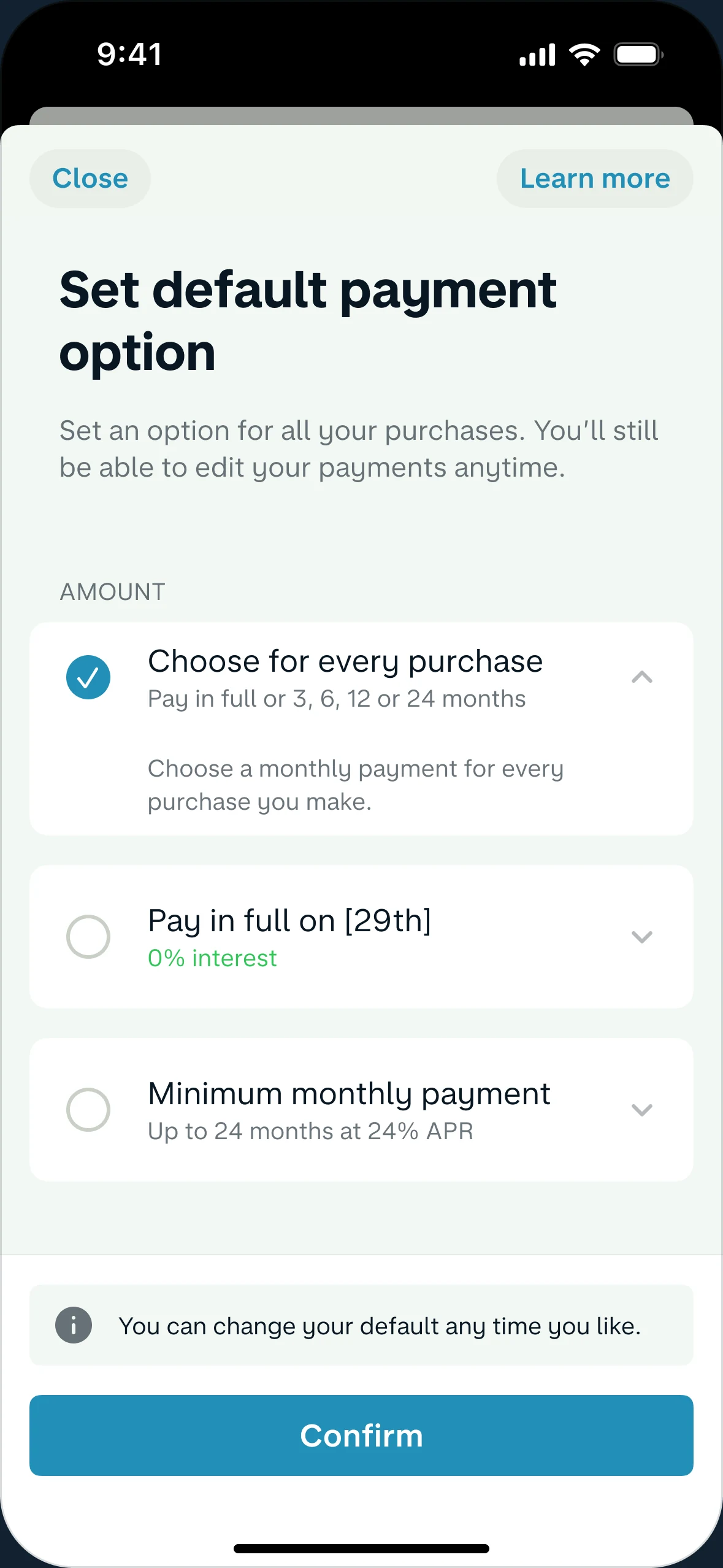
Set default payment option

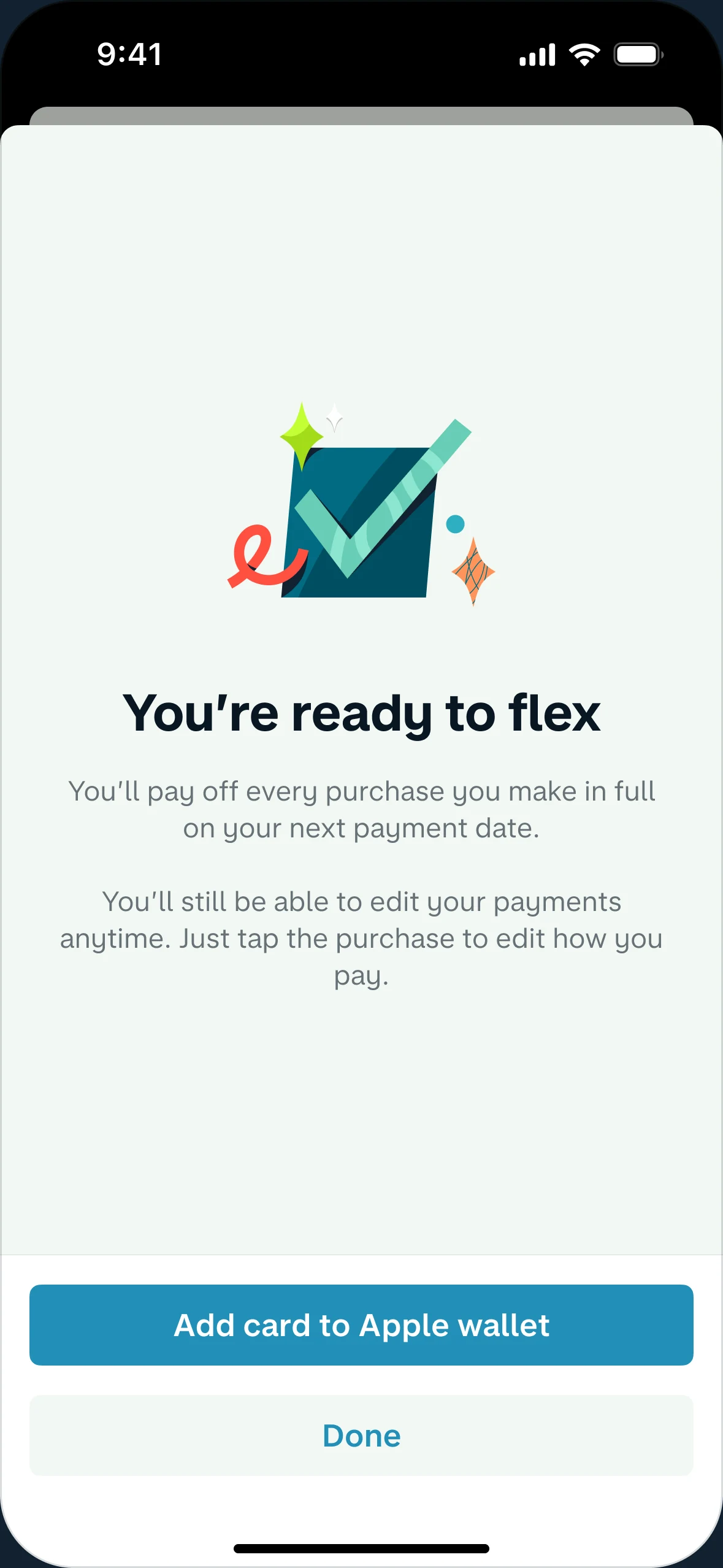
You’ll still be able to edit your payments anytime.

Confirmation: you’re ready to flex
Choose onceA default plan removes a decision from every coffee and train ticket.
Shipped in phasesThe clearer account came first. Editing a monthly amount followed.

Interactive pieces are rebuilt for this page with illustrative numbers. Screens without controls are the real designs.

Designing for real life

One screen. Every financial situation.

A credit product can’t show everyone the same thing. The account adapts to where each customer actually is.

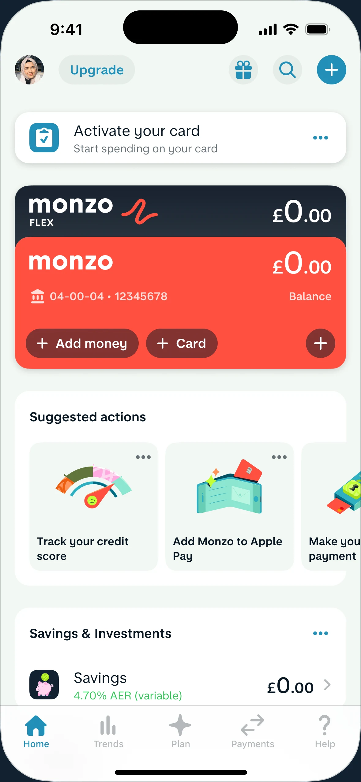
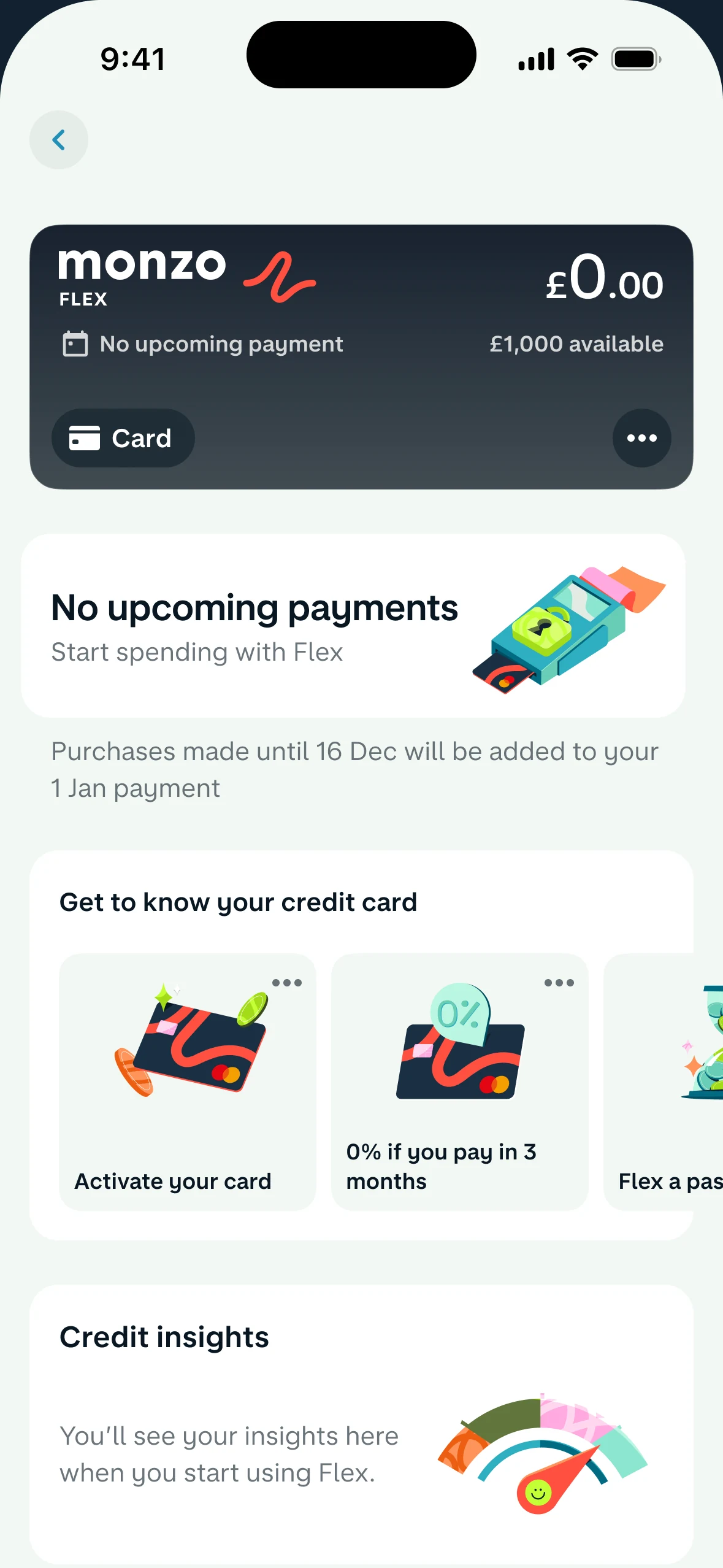
  • Flex account before the first purchaseNot used yet
  • Flex account with a balance and purchasesSpending
  • Flex account on the day a payment is takenPayment due
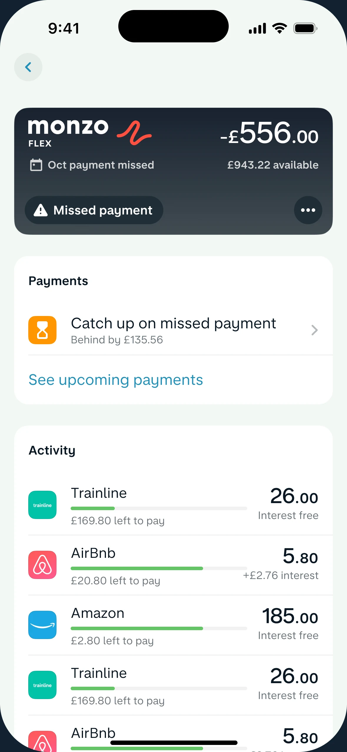
  • Flex account after a missed payment, with a prompt to catch upMissed payment
  • Flex account after a payment, showing the open payment cyclePayment made
What came next

Once Flex worked as a card, two harder questions followed.

What about the things a card can’t pay for? And how do you change someone’s credit limit without losing their trust?

Money Transfers

Paying for what a card can’t.

Builders, personal trainers, group holidays. About 1 in 5 customers who gave feedback wanted this, and Flex needed new revenue that also helped them.

What we learned
People expected it where they already pay others, and a clear fee felt better than interest.
What we did
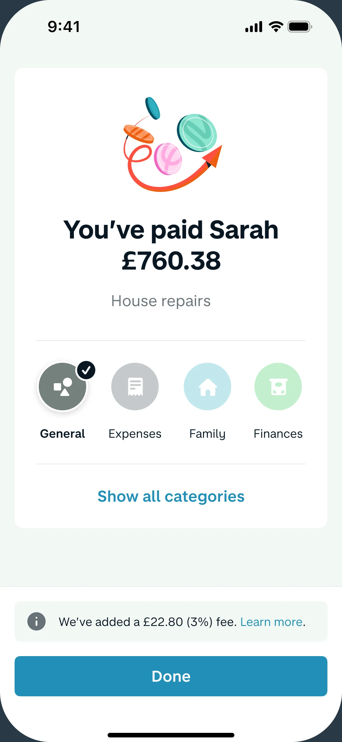
We built Flex into Monzo’s payment flow instead of a separate feature. When testing showed some people missed the fee, we added a deliberate step the first time.
What happened
Adoption went well beyond the forecast.

Pay Sarah Jane

£760.38House repairs

Paying from

You don’t have enough in this account.
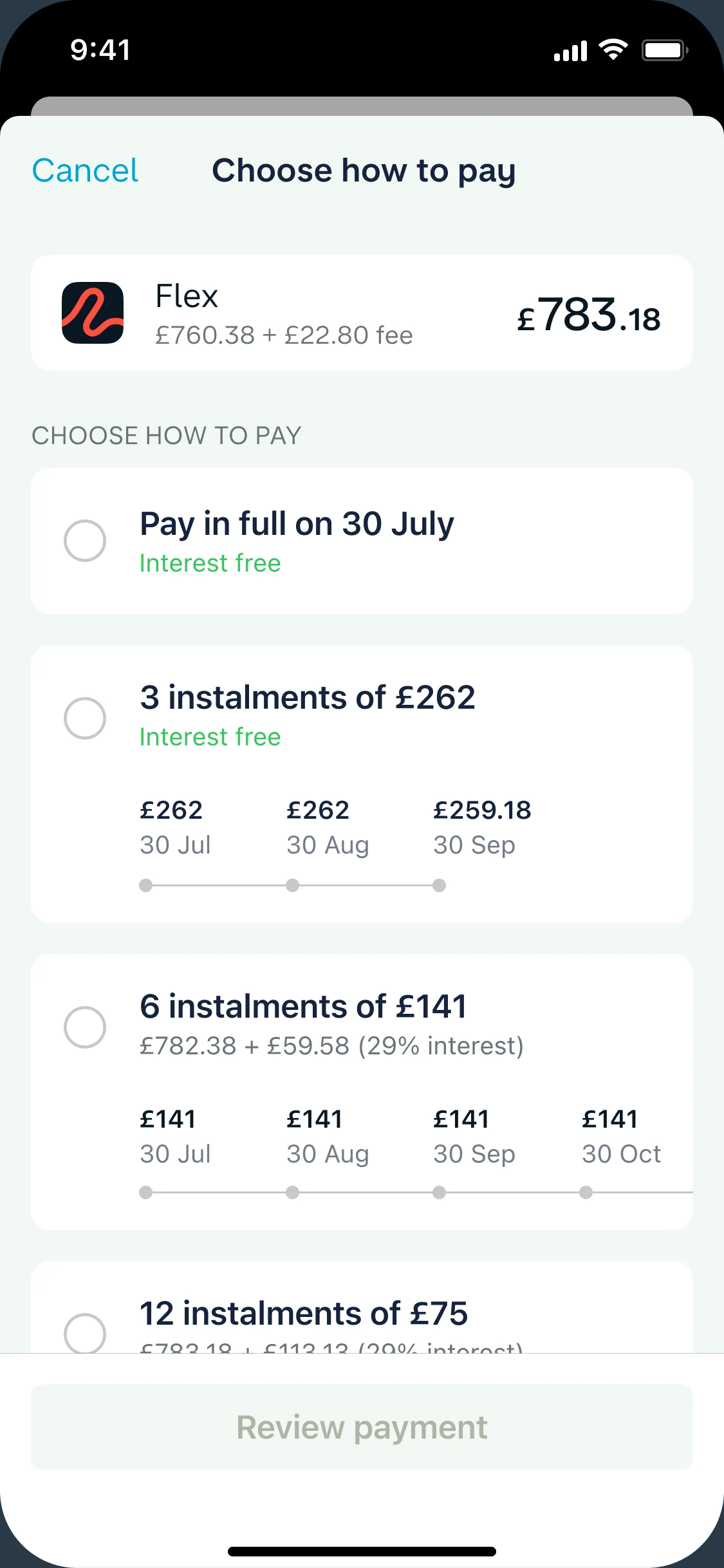
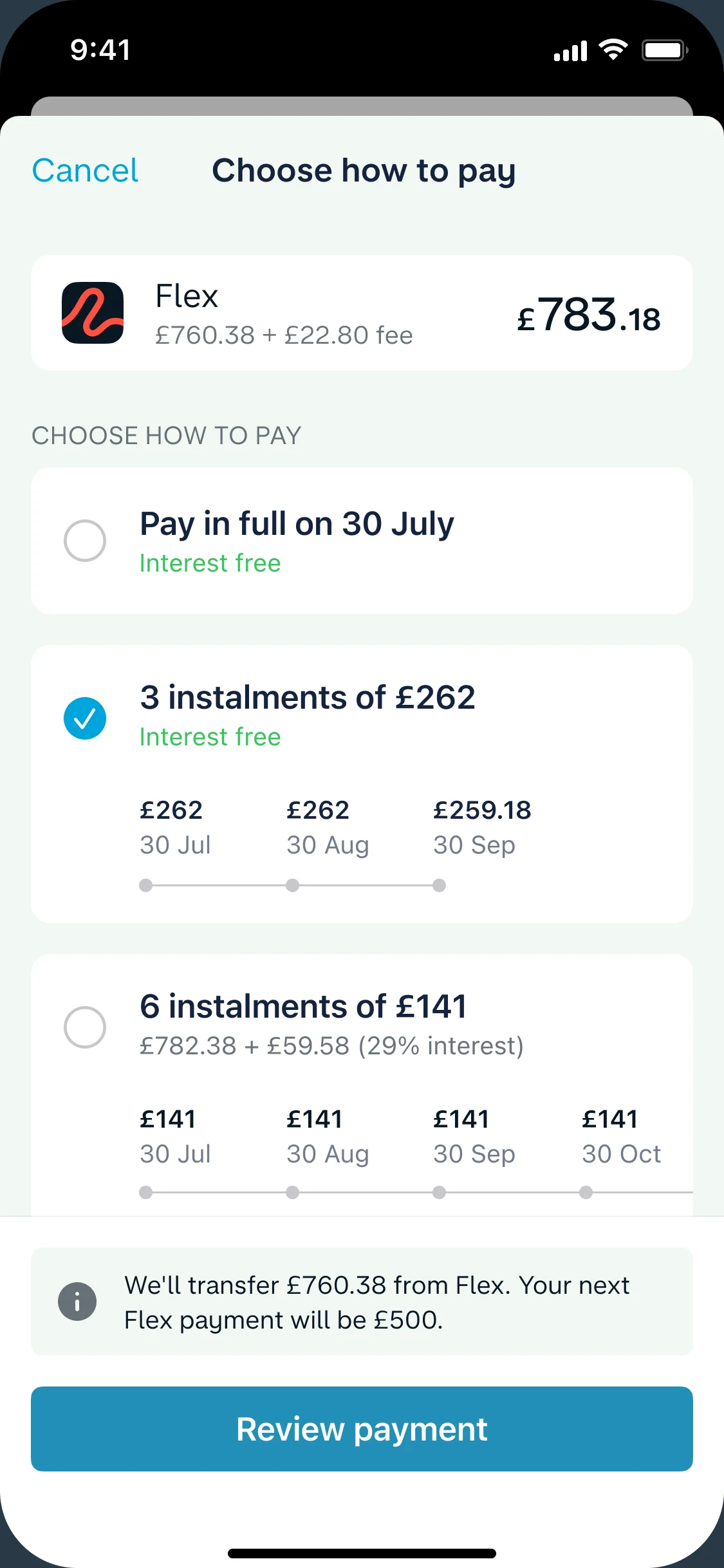
Choosing how to pay back £783.18 with Flex
3 instalments of £262 selected, with a note about the transfer
You’ve paid Sarah £760.38, with a £22.80 fee added
Tap through itStart by switching to Flex.
The few taps above sit on this: the full “Pay someone” flow, with every decision point. Drag to explore.
Limit management

A limit change should never feel like a surprise.

It’s one of the highest-trust moments in credit. Raise a limit carelessly and people can borrow more than they should. Cut it carelessly and it feels like the bank is taking something away.

What we decided
No surprises: fair notice, a plain reason and a real choice, every time.
Raising a limit
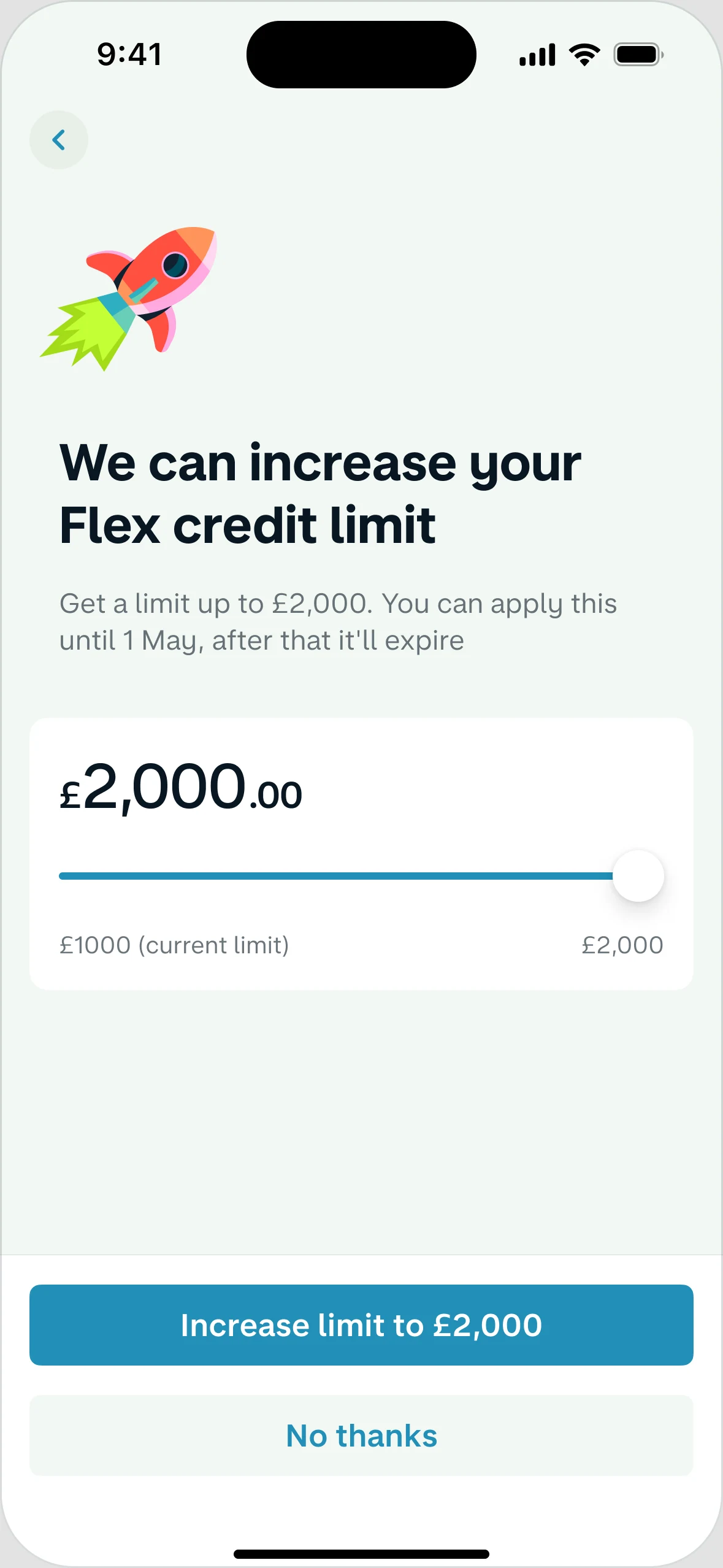
An offer people could turn down or opt out of, with a moment to think before borrowing more.
Reducing a limit
A process with warning and a choice. If someone started using Flex again, the reduction cancelled itself.

We can increase your Flex credit limit

Get a limit up to £2,000. You can apply until 1 May.

£2,000
£1,000 now£2,000
We increased your limit

We’ll let you know if we can increase your limit again in the future. You can opt out of this at any time.

Tap through itChoose an amount, or say no thanks.
In a conversation

There’s more to this story.

This page shows what we shipped. In person, I can walk you through the decisions behind it.

01The test that won more applications but fewer accounts.

Our survey pointed to two ways to make Flex more relevant: many customers used credit cards, and many spent money travelling. So we tested a message for each. The travel message got more people to start an application, but fewer ended up with an account. Interest isn’t the same as customers, so we chose the credit card message.

02Why the kindest default turned out to be the riskiest.

As people used Flex more often, choosing a plan for every purchase became tiring, and some simply forgot. So we let them set a default. Paying in full is interest free, so it looked like the safest option to put first. But when the whole bill arrived, some people didn’t have enough in their account, and more payments failed. So we recommended stopping that version and kept testing a safer one: “Choose for every purchase” shown first, so people still made the decision themselves. With that order, failed payments barely changed.

03The maths hiding behind one slider.

Customers with many purchases wanted to choose one monthly amount, without editing each purchase. It sounds simple, but under the balance every purchase is its own small loan, with its own term and interest. So moving one slider means working out how to split the money across all of them, in the way that saves the customer the most interest.

04What I’d do differently now.

I’d bring the business and risk teams in from the first workshop. Our hardest decisions weren’t only about design: a repayment option could be easy to use, yet cost Monzo money or put customers at risk. Talking about that from day one makes those decisions easier. I’d also measure success by whether customers stay on top of their payments, as well as how many sign up.

Let’s talk ↗